IntroductionImagine you've just designed a two hundred page web site for a client (or maybe for yourself) but at the last minute your client (or you) decide the font is a little two small or the typeface should be serif instead of sans-serif? You didn't know how to use cascading style sheets (CSS) so you coded all of the pages with the old-style tag. If you didn't know CSS, chances are you'd have to replace every occurrence of the old tag with the new tag. But if you had decided to write the site with CSS from the get-go, all you would have to do is replace one single line of code in a master file, and your entire site would be rendered immediately in your new style. That's just one file to upload. That's a lot better than two hundred. Now you can do other things with your time. This is one major reason cascading style sheets are important. CSS makes web site maintenance easier. Cascading style sheets have a side effect of improving page load time for your site. Why does it load faster you ask? There is less data to transfer. Normally, a web browser has to download all of your formatting code in each and every one of your pages on your site. With CSS, the style sheet is downloaded once and cached, and every page beyond your first page is shorter and sweeter. Every page that uses your style sheet is also more consistent, because it is derived from an identical style. No more 14 point typeface on page A and 12 point typeface on page B. Just link both pages to one style sheet, and the formatting is automatic. Cascading style sheets also improve accessibility. If someone has poor eyesight, they can use the advanced feature of a web browser to define their own style. If the can only see 16 point fonts and larger, they can define so in their own personal style sheet. This style sheet can override your defaults, making your site more enjoyable to an even larger audience. Wow, with benefits like easier maintenance, faster loading, page-to-page consistency, and improved accessibility, you'd expect to pay a good $50 for a book or an outrageous $1500 or more for a month long class session, right? Not anymore! Here at davesite.com, you'll learn all fundamental aspects of CSS1 in a matter of hours… the way we like to learn the most, interactively and by example. To start off our understanding of cascading style sheets, we're going to use a special line of CSS code that does something HTML alone could never do right… we're going to indent every paragraph automatically. Here's the CSS code: p { text-indent: 3em; } As you can imagine, in its current form, the code does not but display p { text-indent: 3em; } on the screen instead of changing the way the paragraph tag behaves. We have several choices to implement this as an actual style, all of which are covered in this chapter:
Writing inline style inside each tag is one of the worst ways to design a CSS page, although there are a few rare circumstances where it may be appropriate. But to know CSS, you need to know how to do it, and it will also help you understand how the CSS system works. In our example, p is the selector, that is, what is selected to follow your chosen style. What the web browser understands is that when it sees the tag p, before writing any content, it needs to indent the text 3em. (1 em is a size for laying out glyphs in print... the important thing to understand about 3em is that 3em is about 5 spaces, the typical indentation choice). text-indent is a property, and 3em is the value of that property. All definitions in CSS follow this format: selector { property: value; } You can also include multiple properties and values for a single selector, merely separate them with a ;. If we wanted the paragraph text to be green, we could add color: green; after the text-indent: 3em;. To write inline, we can start with <p> </p>, the normal surroundings of a paragraph. Then, in the opening <p> tag, we'll add special code to say we want a style, merely <p style="">. Then, inside the quotes, we'll add all the properties and values we want this specific paragraph tag to have. So we'll make ours <p style="text-indent: 3em;"> </p> This works just fine, as you can see below, however, we certainly do not want to write that for every paragraph we want to indent! This
paragraph is indented at So we'll make it a little bit easier now, and we'll place a <style> </style> at the beginning of the web page. This should go right before the </head> tag. The format is just like this: <head> With that style sheet at the beginning of the page, every <p> </p> will start with 3em (5 space) indent. So if you have 5 paragraphs that need to be indented, all you need to do is start each with a <p>, and the indent is automatic! Now, imagine you have 10 pages, and you want to make every single paragraph indented. You could include the <style> </style> at the top of each page, but it's much easier to create a single .css file, and link all 10 pages to it. Inside the .css file (we'll call ours main.css) all you do is type: p { text-indent: 3em; } Then, right before your </head> tag in each page add a line similar to this: <link rel="stylesheet" type="text/css" href="main.css" title="Default"> This will link a new style sheet, location main.css, to each page. The title field is optional. With such a short and sweet example, it seems a bit silly to use the link method. But once your style sheet becomes larger, which it will very soon, you'll see the benefit of the write once link many method. That's just one CSS to edit whenever you want to change the look and feel of your site! @import can be used in conjunction with the other methods. Imagine you want 2 pages out of your initial 10 pages to have, in addition to the normal indent, each and every paragraph in blue text. You could write a second style sheet, we'll call it coolblue.css, and inside that sheet you have: p { color: blue; } Then, in those 2 special pages, you place the normal CSS link, but you'll add special code, @import, to add the extra color. <link rel="stylesheet"
type="text/css" href="main.css"
title="Default"> With the import code, you can mix additional styles with a regular style sheet, without affecting the other sheets. So 2 pages now have blue paragraph text, while the remaining 8 pages do not. Those are the basics. Let's review the ways you can include a style sheet:
In our last chapter, we used this example: p { text-indent: 3em; } Remember that p is the selector, text-indent is a property, and 3em is a value. You are certainly not limited to only using style sheets with the HTML element p (paragraph). Remember our old friends H1 through H6? You can also use it with them. If you want to make all H1, H2, and H3 red, and all H4, H5, H6 yellow, your style could look like this: h1, h2, h3 { color: red; } You can use the comma to say you want to define a style for multiple selectors at the same time. You can set a style for nearly all HTML elements. So why don't they just call the value before the { } an element? Well, that's because it's not always an element. You can also choose to make a selector a class of a current element, an element-less class, an id selector, or a pseudo-element. We'll show each of the four in this chapter. Let's make a selector a class of a current element. Remember our paragraph example? Every paragraph is now indented. But what if you want a few paragraphs without an indent? We can define an extra selector. You can pick a name for these, I'm going to call mine noindent. Here's the original code with an added noindent selector: p { text-indent: 3em; } This says that any p that are part of a class called noindent should use 0em indentation. To call that in code, we use class. A normal paragraph looks like this: <p> I'm using a style with an indent. </p> I'm using a style with an indent. A paragraph with the noindent looks like this: <p class="noindent"> I'm using a style without an indent. </p> I'm using a style without an indent. If you are going to only indent some paragraphs, but you probably won't indent most, you can just define a special paragraph called indent. p.indent { text-indent: 3em; } If that's our only style, regular <p> </p> will have no indent, while <p class="indent"> </p> will have a 3em indentation. Why stop at the p tag? Indenting is kind of useful all around. You can make up an element-less selector name and just forgo the element. All you place is a period . and then your class name. Here's a generic example for indent: .indent { text-indent: 3em; } Now, we can use that class for all sorts of things. Here's a paragraph and a H1 both using the element-less .indent selector. <p class="indent"> This is a paragraph with indent. </p> This is a paragraph with indent. <h1 class="indent">This div has an indent</h1>. This h1 has an indent.Imagine a selector .g, defined as { color: green; }. Every time you use class="g" in an element the text color would be shown in green. ID selectors are used for special formatting of only a few elements. ID selectors use a # instead of a .. Imagine 3 paragraphs, we'll call them par1, par2, par3. We'll make one red, one orange, and one blue. We could use these styles: p#par1 { color: red; } ID Selectors can also be element-less: #par1 { color: red; } ...would apply to all tags that specify id="par1" PSEUDO-ELEMENTS There are two important pseudo-elements that are built into CSS capable web browsers. (There are also common pseudo-classes which you'll learn in the links chapter.) These two elements are :first-letter and :first-line. Notice that pseudo-elements are defined with a : instead of a . or # (this is because they have special meanings to a web browser). Here's a silly example for each: Imagine you want the first letter of each paragraph to be red, or the first-line of each paragraph to be green. p:first-letter { color: red;
} This example is kind of You can also apply these pseudo-elements to only certain classes of p, for example, if you make a p called seasonal, you could use this style: p.seasonal:first-letter { color: red; } <p>This paragraph is not<br>
seasonal.</p> This paragraph is not However, this paragraph One of the interesting things about using CSS is that most things can have a background image, background color, and foreground color. The entire page's properties can be made using a body selector, while you can easily use other selectors such as p or table to define background and color properties. You are probably familiar with the <body> tag. A typical <body> tag looks something like this: <body background="graphic.jpg" text="#FFFFFF" bgcolor="#000000"> To convert that into CSS, it looks like this: body { background-image: url(graphic.jpg); Big deal right? But CSS adds some special features. One of the most important is the background-repeat property. It has these values: repeat, repeat-x, repeat-y, or no-repeat. A regular web page has a default of background-repeat: repeat, which means the image is repeated both horizontally and vertically. With CSS, you can set the background to repeat horizontally (repeat-x), repeat vertically (repeat-y), or not repeat at all (no-repeat). We can edit the style mentioned above to have the body's background never repeat by adding background-repeat: no-repeat: body { background-image: url(graphic.jpg); If you want to include the repeat in your standard background tag (for example, if are not using CSS for the rest of your page), you can add style="background-repeat: no-repeat;", so it looks like this: <body background="graphic.jpg" text="#FFFFFF" bgcolor="#000000" style="background-repeat: no-repeat;"> Remember that although over 90% of web browsers in use today support CSS, there are still some that do not. It may be helpful to use the standard <body> tag to define a text and bgcolor, and then use a style sheet to define everything else, using the same color and background-color values. If you are using anything but repeat for a background-repeat, you should read the margin chapter of this guide to make sure your background doesn't make your text hard to read. There are two more important background properties: background-attachment and background-position. background-attachment merely allows you to decide if you want the background to scroll or not. If you want it to scroll, use background-attachment: scroll. If you want it to not scroll, use background-attachment: fixed. background-position allows you to position the background. It takes two values, the first is the the vertical position (in px [pixels], % [percent], or top, center, bottom) and the second value is the horizontal position (in px [pixels], % [percent], or left, center, right). If you want a background to be at the top right, use: background-position: top right. If you want it to be at the bottom center, use background-position: bottom center. This is typically most useful used with background-repeat: no repeat. As you can see, the coding for the background can get pretty long. CSS lets you combine it all into a single property statement, known as background. It follows this format: background: background-color || background-image || background-repeat || background-attachment || background-position If you want a background color of white, a background image lightpattern.jpg, the background to never repeat, and never scroll, you could use: body { background: #FFFFFF url(lightpattern.jpg) no-repeat fixed; } Remember, you'll also need to set the text color, so add color: #000000 (if you want black text) body { background: #FFFFFF url(lightpattern.jpg) no-repeat fixed; color: #000000; } Notice that the browser is smart enough to realize that a value (in this case: background-position) is missing and it ignores that value. Always set a text and bgcolor in <body> for full browser compatibility. You are probably already familiar with both the color: and background-color: properties from earlier chapters. The four common color formats are as follows: Name the 16 common VGA colors named in most browsers are: aqua, black, blue, fuchsia, gray, green, lime, maroon, navy, olive, purple, red, silver, teal, white, and yellow. Hexadecimal format #xxxxxx ( #000000 - #FFFFFF ) Red/Green/Blue Values (x, x, x) where each x is that colors value from 0 - 255 Red/Green/Blue Values (x%, x%, x%) where each x is a value from 0.0% to 100.0% Hexadecimal is the most common format for color. It allows easy matching to graphics' colors, because all major graphics software support hexadecimal color. The font-family property is equivalent to the face property in the <font> tag. If you use this property you need at least one font or font-type listed. It is recommended to have 2 or 3 different fonts, the last of which is a standard font type of one of the following:
If you want all paragraphs to first try to use Times, and if Times is not on the system, use a serif if available, you could use: p { font-family: Times, serif; } (You'll commonly see this as p { font-family: 'Times New Roman', Times, serif; } because Macs and PCs name the Times font differently.) The font-style property can use one of three values: normal, italic, or oblique. The font-weight property can use one of four build in values: normal, bold, bolder, lighter. It can also use a value in the range of 100 to 900, in increments of 100. (For a baseline, normal is defined as 400, and bold is defined as 700). There is a font-variant property, which is merely either normal or small-caps. The last individual font property is font-size. It can be relative to the text around it (smaller or larger), a set size in pt (e.g. 14pt) or em (e.g. 1.5em) or an absolute size by text description, from one of the following: xx-small, x-small, small, medium, large, x-large, xx-large The font also has a combination property called font, which is in this format: [ font-style || font-variant || font-weight ]? font-size [ / line-height ]? font-family So if simply wanted a bold 12pt Serif, you could use: font: bold 12pt serif; bold 12pt serif If you wanted it double-spaced, you could add the line-height: font: bold 12pt/24pt serif; this is a double-spaced You've probably already run into the text-indent and line-height properties in this tutorial. (text-indent is the indentation at the beginning of an element, such as a p, and line-height is the space a line occupies, including text and the white-space above it.) You can also use the properties letter-spacing and word-spacing, which should be somewhat self-explanatory. Common units for values of either of these properties are px or em. (E.g. 2px) The text-align property comes in handy frequently. You can set this to left, center, right, or justify. The first three act exactly like they sound. justify just inherits its alignment from the element around it. You can do a few cool things with the text-transform property. You can set it to capitalize (first letter in each word), uppercase (all letters), lowercase (all letters), or none (no special transformation). Last but not least of the text styles is
the text-decoration property. This is one of the most widely used properties, and you'll
see why in the next chapter on links. The values for text-decoration are none
(regular text), underline, overline, Welcome to the links chapter. Using links within cascading style sheets was the thing that really drew me in. My guess is half of you ended up at this tutorial and clicked right to links, and half of you ended up here by following the suggested chapter-by-chapter method. If this is your first chapter, please, please, please read the font and text chapter before attempting to use CSS for links. Everything here will make much more sense that way! Yes, yes, yes moment you've been waiting for. Here are the pseudo-classes for the link element. (Remember pseudo-classes and pseudo-elements use a :.)
(Please remember that you have to place these styles in pages by one of the methods discussed in the Basics of CSS chapter.) All of these pseudo-classes can have a color and a background color, fonts, and text properties. (You can also add other CSS properties, try some out!) The fun part comes with hover: because it is responsive to the mouse cursor. I'm going to teach you a few poor design things just so you can get used to how :hover works. Then I'll give some recommendations in the next section. Imagine a page with links having an underline and the link text being a normal size. When the mouse moves over the link, you want the link text to suddenly lose the underline and you want it to be twice as big (I didn't say your imagination was rational!). You can't do this with HTML alone. But with CSS, it's this easy: a:link { text-decoration: underline, font-size: 1em; } Now, you can see this example is somewhat silly, because it's quite obnoxious to have a link be twice as large when it's "hovered." More commonly, it just loses (or adds) an underline, and perhaps changes color slightly. Using CSS, you can add all sorts of fun properties to links. You can define classes of links. If you want one set of links to be called "greenhilite" you could use a.greenhilite:link, a.greenhilite:visited, a.greenhilite:hover, a.greenhilite:active, and appropriately use it as follows: a.greenhilite:link { color: blue; } <a class="greenhilite" href="http://www.davesite.com">davesite.com</a So you've seen a terrible way to use hover, and a pretty good way to use hover. The three most common ways people use hover are as follows:
So this should be simple enough. To add an underline, your style could look like this: a:link { text-decoration: none; } To remove an underline, your style could look like this: a:link { text-decoration: underline; } To change the background-color, simply add it inside :hover (and :active if you'd like): a:link { text-decoration: underline; } Do you remember your old friends UL (unordered list) and OL (ordered list)? Cascading style sheets have a few enhancements for these lists. Most people have wanted a way to use an image for each point of an unordered list. Cascading style sheets make this trick really easy to do. Make a small graphic (background transparent are preferred). Then you can link to it with a style similar to this: ul { list-style-image: url(smallimage.gif); } But what if you have a sub-list, that is, a UL within a UL. You don't want the second one to have the same image? You can define a special style for UL only within UL, similar to this: ul ul { list-style-image: url(smallimage2.gif); } If you use both styles in the same sheet, the points of the main list will be preceded by smallimage.gif, and the points in the sublist will be preceded by smallimage2.gif. You can continue on, adding more UL as you please. Just don't go too deep into sub-lists, you'll confuse your viewing audience! Remember all those fun outlines you did in school (or maybe the one you did this morning on the job)? CSS gives you a way to auto-format your ordered lists to meet nearly any style. It's similar to the list-style-image used above, it's called the list-style-type property. It can be one of these values: disc, circle, square, decimal, lower-roman, upper-roman, lower-alpha, upper-alpha, none. So, if you want the OL to have I, then A, then 1. then, a, then finally i., you could do this style sheet: OL { list-style-type: upper-roman; } <ol> <li>Web Design <ol> <li>HTML <li>CSS <ol> <li>Intro <li>Basics <ol> <li>Inline <ol> <li>You can include styles inline using style="" </ol> </ol> </ol> </ol> </ol> It looks like this:
There is one more individual property to the list that should be noted: it's called list-style-position. It's merely inside or outside, and sets whether the second, third, etc., lines of text should start under the list marker, or immediately right beneath the marker. <ul style="list-style-position: inside;"> <li>This list has position set<br> to inside. <li>You can see how the text falls<br> on the second line. </ul> <ul style="list-style-position: outside;"> <li>This list has position set<br> to outside. <li>You can see how the text falls<br> on the second line. </ul>
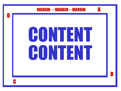
Finally, there is a combination list style property, called list-style. Its first value is the type of marker, the second value is either inside or outside, and the third marker is the url() of the image. If you want a list that defaults to a disc, shows text inside the marker, and uses an image marker.gif if available, it could look like this: ul { list-style: disc inside url(marker.gif); } A margin is the space around something. You may remember typing papers with margins, perhaps 1 inch on each side. If you've designed web pages for a while, you're probably familiar with marginwidth and marginheight in the <body> tag at the beginning of a page. CSS aims to give you total control over margins, but not only for the body, but also for any block elements: lists, images, paragraphs, div's, span's, etc. You'll still want to set the marginwidth and marginheight to appropriate values even if you choose to set the margin property of the body tag. Margin values can be fixed amounts, such as px (pixels), or % (a percentage), or set to auto.
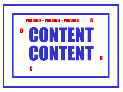
Margins work clock-wise. As you can see in the image above, location A then B then C then D. You can define all margin values in a single definition by separating each value of A B C and D with a space, after the selector margin:. If you want a page to have no margin, you could use: body { margin: 0px 0px 0px 0px; } If you want a page to have a 15 pixels on top, 10 on the left, and the right and bottom automatically set, you could use: body { margin: 15px auto auto 10px; } If you wanted a 10% margin at the top and no margin on the other sides, you could use: body { margin: 10% 0px 0px 0px; } You can also set each of the four margin values individually, with the properties margin-top, margin-right, margin-bottom, and margin-left, respectively. The style above with the 10% margin could instead be written: body { margin-top: 10%; margin-right: 0px; margin-bottom: 0px; margin-left: 0px; } Remember that the margin property may apply to more than just a body selector. If you are reading this for a class and your professor wants you to summarize any two chapters, I'd definitely pair this one with the margin chapter! padding: is just like a margin, except it's the white space between the margin (and border) and the actual content. Unlike margin, which inherits the background color of whatever is around the margin, padding uses the background-color specified for whatever it is padding (e.g. the "content content").
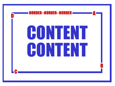
Padding is just as simple as margin to use, and it follows the same format (A B C and D as pictured). If you want a paragraph to have 5px (pixels) of padding all around it, you could use: p { padding: 5px 5px 5px 5px; } You can also use auto or a % (percentage), just like a margin. The four individual padding properties are padding-top, padding-right, padding-bottom, and padding-left. A border can be a visual separator between the margin on the outside, and the padding on the inside. You can set the width, color, and style of the entire border, or you can set each of these properties individually for each side.
The border-width property allows you to set all four widths at the same time, in format A B C and D as pictured above. The value can be thin, medium, thick, or a numeric value and unit, such as 5px or 0.2em. If you want to a medium border around every paragraph, you could use: p { border-width: medium; } But guess what? The default border is no
border at all, so you'll need to add a second property, border-style, if you want any border to visually appear. The
values for border-style are: The first five appear just as they would seem to appear by their description. The last four are special 3D looking borders So let's make each paragraph have a medium border that is dotted: p { border-width: medium; border-style: dotted; } So close to getting our border perfect. But what if the border to be blue? Simple. It's the border-color property. Just set it to blue: p { border-width: medium; border-style: dotted; border-color: blue; } Wouldn't it be nice to have a combination property? There is. It's just border:, and it expects width, style, then color. So the example immediately above could be simplified to: p { border: medium dotted blue; } If you want to set each of the four borders individually, you can. The properties are border-top, border-right, border-bottom, and border-left. The values expected are width, style, then color. If you wanted every paragraph with a dotted left border in red, and a dashed right border in purple, you could use: p { border-left: dotted red; border-right: dashed purple; }
|