|
Stylesheets Tutorial
Building Web pages with HTML is like painting a portrait with a paint roller. Only truly determined and tenacious souls can achieve the exact result they want. It's just not the right tool for precision and flexibility. Anyone who's used HTML for more than a week knows it isn't a very effective tool for making Web pages. That's why we sometimes resort to making large GIFs when we want just the right font or layout. That's why we're forced to use convoluted table tags and invisible spacer GIFs to push things around on a page. It's ridiculous, really. Our code gets too complicated, our GIFs too numerous, and our final pages too bandwidth-heavy. It's not exactly optimal Web page construction. But in late 1996, stylesheets quietly entered the scene. Officially called cascading stylesheets (CSS), it was an elegant cousin to HTML that promised: À more precise control than ever before over layout, fonts, colors, backgrounds, and other typographical effects; À a way to update the appearance and formatting of an unlimited number of pages by changing just one document; À compatibility across browsers and platforms; and À less code, smaller pages, and faster downloads. Despite lukewarm support from many of our favorite Web browsers, CSS is starting to make good on these promises. It's transforming the way we make Web pages and is the cornerstone of Dynamic HTML. We'll spend the next five lessons taking a tour through the land of stylesheets. You'll learn the basics of how to create and use cascading stylesheets within your Web pages as well as what's possible with fonts, typography, colors, backgrounds, and positioning. In Lesson 1, we'll take a quick trip through the basics of stylesheets, giving you everything you need to get started quickly. Let's begin by asking the most important question: What can stylesheets do for me today? What Can Stylesheets Do for Me Today? So what's so special about stylesheets? In a nutshell: À You can separate form and structure. À You can control layout like never before. À You can make smaller, faster pages. À You can maintain or update many pages at once, faster and easier than before. À You can be browser friendly. À You can fancy up your pages with neato tricks, like have two visited link colors or control text sizes with a iron fist. Let's look at each benefit. You can separate form and structure. HTML was never meant to control the form or appearance of Web pages. It's a language that defines the structure and function of elements on a page. It lets the Web browser decide how those elements should actually appear. But we perfectionist Web designers wanted more. So we rejoiced when Netscape invented new HTML tags that let us begin to control appearance. To make body text look the way we wanted, we surrounded the <P> with <FONT FACE>, <I>, and so on. And then we put everything inside a nested table and used invisible spacer GIFs to push it over 20 pixels to create a margin. What a mess. Our code became convoluted, and it was harder and harder to create or move content to the Web quickly. Cascading stylesheets enable us to get more control the right way: by separating the part that defines structure from the part that defines form. The HTML remains clean and simple, as originally intended, and the CSS code controls appearances from afar. You can control layout like never before. Sure, <FONT SIZE> enabled us to resize text, and table tags helped us create margins. But overall, what we could do with HTML was very limited. We couldn't create text exactly 80 pixels tall, we couldn't specify margins easily, we couldn't control the space between lines or words, we couldn't precisely position images on the screen. Until now. Stylesheets make all these things possible and more. And the promise of what's to come is even more exciting. In the next four lessons, you'll see what I mean. You can make smaller, faster pages. Here's more good news: Stylesheets are simple text, just like HTML. There are no graphics, no executable program, no plug-ins, no streaming, no delays. It's as fast as straight HTML code. And with CSS, you can do things that you previously had to resort to GIFs for. But wait, there's more! As I mentioned earlier, cascading stylesheets also mean fewer table tags and other HTML hacks cluttering up your code. Less code and fewer graphics translate into smaller file sizes. You can maintain or update many pages faster and easier. Without stylesheets, if I wanted to update the font used for body text across my entire site, I'd have to manually edit each page. Even if my site were served from a database, I'd still have to update all the templates, and within each template, I'd have to change every single instance of good ol' <FONT FACE>. The whole point of stylesheets is to separate form and structure. With stylesheets, I can have all the pages on my site point to a single CSS document. If I want to change the body text, all I do is change one line in this stylesheets document, and the entire site instantly changes. You can be browser friendly. Unlike some other Web technologies I could name, CSS code degrades gracefully. That is, users don't get a glaring broken icon if they're missing a plug-in or code gibberish if they're using an older browser. Browsers that recognize cascading stylesheets use it. Browsers that don't recognize CSS simply ignore it. Are you convinced that stylesheets are a good idea? OK, then let's create one. Your First Stylesheet It's about time we get to the good stuff! Launch your favorite HTML editor and create a basic Web page: <HTML> Very fancy. Now let's add some stylesheets. Simply insert the following code anywhere within the <HEAD></HEAD> tag:
<STYLE TYPE="text/css"> Open the page in your browser, and here's what you'll see: Stylesheets: The Tool of the Web Design GodsAmaze your friends! Squash your enemies! Click here to see how it would look if your browser doesn't support CSS. Congratulations! You just created your first stylesheets-enhanced Web page. (If the "Amaze your friends!" line doesn't have yellow behind it, then you'll need to update your browser or you won't be able to complete this tutorial. Netscape Communicator or Internet Explorer, version 4 or higher, is recommended.) Some Terminology Let's look at what's going on in this newfangled code. At the core of cascading stylesheets are rules. The simplest kind of rule looks like this: H1 { color: green } This rule tells the Web browser that all text surrounded by <H1></H1> should be displayed in green. Each rule consists of a selector and a declaration. In the example above, H1 is the selector. It's the HTML tag that the style is being attached to. The declaration defines what the style actually is, and it also consists of two parts: the property (in this case, color) and the value (green). Any HTML tag can be used as a selector. Thus, you can attach stylesheet information to any kind of element, from normal <P> text to <CODE> and <TABLE> content. You can even use some cascading stylesheet properties on graphics by applying them to <IMG>. And as you can see from our first stylesheets example, you can also group rules together. Earlier, we set three different declarations all at once for <P>. Similarly, you can group selectors: H1, P, BLOCKQUOTE { font-family: arial } This rule specifies that all text within <H1>, <P>, and <BLOCKQUOTE> tags will display in the Arial font. Inheritance Stylesheets rules are inherited from "parent" to "child." Let's look at an example: B { color: blue } This rule tells the browser that all text within <B> should be blue. But what does the browser do in the following situation? <B>All my Web pages will use cascading stylesheets within <I>four</I> weeks.</B> There's no rule set for the <I> tag. But since here it occurs within the <B>, it inherits the latter's declarations. So, the child displays in blue, just like its parent: All my Web pages will use cascading stylesheets within four weeks. OK, now we know how basic stylesheets rules work. We've also seen one way to add stylesheets to Web pages, but there are other methods. Let's take a look. Adding Styles There are actually four methods you can use to add styles to your page, each with its own benefits: À Embed a stylesheet within the HTML document. À Link to an external stylesheet from the HTML document. À Import an external stylesheet into the HTML document. À Add styles inline in the HTML document. Embedding a Stylesheet This is the method we used on the previous page. All the stylesheets information lives at the top of the HTML document, separated from the <BODY> of the HTML code. Here's a refresher of what the code looks like:
<HTML> When stylesheets rules are embedded, browsers honor them for the length of the HTML page. When you want to add stylesheets one page at a time, this is the way to go. You probably noticed two curiosities in this code: the TYPE="text/css" attribute and the comment tags. TYPE="text/css" specifies the MIME type so browsers that don't support CSS can ignore stylesheet code altogether. Use it. The comment tags (<!-- and -->) are even more important. Some older Web browsers (such as IE 2.0 for Mac) won't recognize stylesheets code in spite of the TYPE="text/css" attribute and will display the stylesheets code itself! This is not a good thing. Use comments, and this snafu will never happen. Linking to a Stylesheet Here's where stylesheets start to get powerful. Instead of embedding stylesheets code one page at a time, you can point multiple HTML documents to one central stylesheets document. This external file will set the rules for all of your Web pages. If you change a detail such as the font size in the stylesheets file, all of your pages will instantly reflect that change. If you maintain a large site, this feature is heaven. Here's how it works: Create your Web page normally but instead of the <STYLE> tag, use the <LINK> tag within the <HEAD>, like so:
<HTML> (With a linked stylesheet, you don't have to use comment tags.) Now create a separate text file called mystyles.css (you can name it anything you want). All it contains is this:
H1 { color: green; font-family: impact } Upload this CSS file to your server the same way you would an HTML file. When you view the page in your favorite browser, you'll see that the browser has followed the <LINK> tag and honored all of its stylesheets rules in the HTML page. You can link to the same stylesheets file from an unlimited number of HTML documents, and you can use relative or absolute URLs with the HREF attribute. Importing a Stylesheet Importing an external stylesheet works similarly to linking. The difference is that you can't combine the linking method with other methods, whereas you can combine importing with other methods. Let's look at an example:
<HTML> Let's say that the company.css file looks like this:
H1 { color: green; font-family: times } In this example, the browser first imports the company.css rules (the @import line must always be first) and then adds the embedded rules to it to get a collection of rules for the entire page. Notice, however, that H1 has a rule both in the external stylesheets file and in the embedded styles. What does the browser do in the face of this conflict? The embedded rules win out, and the text displays as orange Impact: Stylesheets: The Tool of the Web Design GodsAmaze your friends! Squash your enemies! Click here to see how it would look if your browser didn't support CSS. The flexibility of importing stylesheets is wondrous. You can import as many stylesheets files as you want and override them with embedded styles as desired. Unfortunately, Web browsers have been slower to support this method of adding stylesheets to Web pages. Only IE 4 and 5 support importing, so I recommend avoiding it for the time being. Adding Styles Inline Finally, you can also add styles inline, which means inserting stylesheets rules right in the middle of all your HTML. It might look like this:
<HTML> In this scenario, you wouldn't need any stylesheets code at all at the top of your HTML document. The inline STYLE attribute would give the browser all the information it needs. The big downside here is that you have to add the inline style code every single time you want to use it. The next <H1> text after this one would revert back to the default browser display unless you add another STYLE attribute. Inline styles are considerably less powerful than embedded, linked, and imported styles, but you might find some use for them. For example, if all your paragraphs are styled with a linked stylesheet but you want to override the style of one paragraph, you can use inline style to do so. Remember, you can use more than one of these methods at a time. In fact, the power of stylesheets lies in combining the ways that styles are added to pages. Classes and Other Tricks We've covered all the basics of CSS syntax. Now let's go over a few more tricks and shortcuts that you'll be glad to know about. Classes We said before that any HTML tag can serve as a selector and have stylesheets declarations attached to it. But what if you want something more complex than that? What if, for example, you wanted body text to be green for the first paragraph, purple for the second paragraph, and gray for the third? That's where classes come in. You could create three different classes of P, each one with a different stylesheet declaration. The rules (either embedded in the HTML document or in an external stylesheets file) would look like this:
P.first { color: green } And your HTML code would look like this:
<P CLASS="first">The
first paragraph, with a class name of "first."</P> You can name classes anything you want, but make sure to use a period before the class name in the stylesheets rule. You can also create classes that aren't attached to any HTML tag at all: .first { color: green } This approach is more flexible, because now we can use CLASS="first" with any HTML tag in the <BODY> of the page, and the text will be displayed in green. Contextual Selectors Let's say you want all bold text to be red but only if that bold text occurs in regular <P> body text. It's not possible, right? Wrong. With stylesheets, even your wildest dreams can come true (OK, maybe I'm exaggerating slightly). Contextual selectors are selectors that demand that a certain situation be true in order for their declarations to be carried out. P B { color: red } <H1><B>Emma
Thompson</B>, Actress</H1> The stylesheets rule tells the browser to make all bold text red only if it appears within <P> text. Thus, when the above HTML code is displayed by the browser, the bold text in the first line isn't red, but the bold text in the second line is. Comments Even with the clean code that's created with stylesheets, commenting your work is a good idea. Fortunately, comments are possible within stylesheets code and can be used on any line, like so:
P.first { color: green } /* green for
the first paragraph of every page */ When Stylesheets Fight It Out The scene is set for battle. Let's say there are three different stylesheets rules at work and all of them use P as the selector. An imported stylesheet tells the browser to display <P> text in red. An embedded stylesheet tells the browser to use blue. And an inline stylesheet tells the browser to use yellow. What's a poor Web browser to do? Thankfully, browsers that support stylesheets have a built-in cascading order of rules that instructs them what to do in these kinds of situations. Ultimately, some kinds of stylesheets rules are more important than others. According to the official specification of cascading stylesheets, here is the order of importance: 1. Inline styles 2. Embedded styles 3. Linked styles 4. Imported styles 5. Default browser styles So inline styles override embedded styles, which override linked styles, and so on. It's nice and elegant, right? Not so fast. Unfortunately, Netscape and Microsoft have been slightly less than perfect in implementing this order in their browsers. If I apply styles to the same selector using all these methods, then the browsers get it right and treat inline styles as most important, embedded styles as next-most important, and so on. But if my styles are applied to different selectors and inheritance is involved, all hell breaks loose. For example, both browsers give more importance to linked styles than embedded styles. For now, your best bet is to stick with one method of adding styles to Web pages, especially when you're sure that stylesheet rules will conflict. But even if this cascading order worked perfectly, we would still have a problem. What happens when multiple rules of the same kind conflict? What happens, for example, if one embedded rule declares <P> text green and another embedded rule declares it red? Thanks to the wise sages who wrote the stylesheets specification, there's an order for solving these conflicts too. It's complicated, but here's an oversimplified guide to what browsers check for: 1. Use the one stylesheets rule that's specifically declared. Example: BODY { color: green } <P> text is specifically declared red by one rule, but it also inherits the green value from the <BODY> rule. (If you give <BODY> a declaration, everything on the entire page inherits it.) In this situation, the specific rule outweighs the inherited value, so red wins out. 2. Use the one stylesheets rule that's inherited. If step number one doesn't result in a winner (i.e., if there's no rule that's specifically declared or if there are multiple rules that are specifically declared), the browser moves on to this step. The browser looks for an inherited rule and uses one if it finds one. If it finds none or if there are multiple inherited rules, the browser moves on to step number three: 3. Use the stylesheets rules in the order they appear in the code. Example: P { color: green } When all else fails, the browser resorts to using the order in which the rules appear. In the above example, <P> text would display in red because it's the last rule given. Note: The official cascading stylesheets specification goes into a lot more detail about this cascading order, including other concepts of importance and specificity, but since those are not well supported by the major browsers, I won't bother to go into them here. One final question: What happens when stylesheets rules collide with HTML tags? Take a look at this example: I { font-family: impact } <P>I think <I><FONT FACE="Times">East of Eden</FONT></I> is Steinbeck's best novel.</P> The stylesheets rule tells the browser to use Impact, but the familiar HTML <FONT FACE> tag demands Times. It's an obvious conflict. According to the official stylesheets specification, stylesheets should win out. Only if there are no applicable CSS rules should the browser use the HTML tag instead. Unfortunately, the major browsers aren't built this way. Netscape Communicator and Internet Explorer both treat HTML tags as more important than stylesheets rules if the HTML is closer to the affected text. Sigh. As you can see, there are all sorts of problems with the browsers' support of stylesheets. Let's get the bad news over with. The Bad News About Browsers I'll make this short and bittersweet: Cascading stylesheets are great, Web browsers are not so great. Internet Explorer 3.0 was the first browser to try to support stylesheets, and its attempt was valiant, particularly because at that point the official specification had yet to be solidified. As a result, IE 3 supports most of the CSS properties, albeit with some bugs. You'd think that by the time IE 4 and Communicator 4 came out, stylesheets support would be rock-solid in both of them. Well, it wasn't. It looks like the development teams at Microsoft and Netscape each had their own interpretations of some of the CSS properties, and other properties weren't supported at all. The result? Designing a CSS-riddled site for older browsers can feel like walking in a mine field. Most things work but some don't. And even when things seem to work fine, you'll find they appear differently depending upon the browser. Luckily, over 75 percent of Web users surf the Web with IE 5, which is a bit kinder with CSS - but it's still not 100 percent. Betas of IE 6 and Netscape 6 are much more promising, but relatively few people use them. Webmonkey's Browser Chart gives you a general idea of which browsers support what. But for the details, you'll have to test as you go. When using stylesheets code, it's essential to test your end product on multiple browsers and multiple platforms. This is the only way to avoid unpleasant surprises. And when you find that your razzle-dazzle, stylesheeting-action site doesn't work on older browsers, you'll have to concoct a tamer version of the site to serve up for those old-school users. That about wraps it up for Lesson 1. Now let's review. Review of Lesson 1 In this first lesson, we discovered the magic of stylesheets and the basics of their use. Why use cascading stylesheets? Because they provide unsurpassed control over the layout of Web pages. They're also the most efficient way to maintain and update a large site, and they make for smaller pages that download faster. CSS works through individual stylesheets rules that consist of selectors and declarations. These rules can be embedded in an HTML document, linked to or from an HTML document, imported to an HTML document, or added inline within an HTML document. Each method of adding CSS to Web pages has its own benefits. What's next? In the next four lessons, we dive into most of the individual stylesheets properties that give CSS its power. You've seen a few examples in this lesson. Starting with Lesson 2, we'll explore each in more detail. Here's a quick map of where we're going: À Lesson 2: Fonts À Lesson 3: Typography and Layout À Lesson 4: Colors and Backgrounds À Lesson 5: Positioning Stylesheets Tutorial Welcome to Lesson 2 of our tutorial on the wondrous language known as cascading stylesheets. After Lesson 1 on the basics of how to use and add stylesheets to Web pages, we can now begin exploring the individual properties that make them more than cool. Lesson 2 is devoted to fonts: calling them by name, controlling text size, specifying all manner of bolds and italics, and adding special effects. Do you think you can do all these things with existing HTML tags? Well, you can't. The CSS properties covered in this lesson include: À font-family À font-size À font-weight À font-style À font-variant À text-transform À text-decoration À font Let's get started. Calling Fonts by Name First thing's first: How do you tell the Web browser which font to display? You just type the name of the font after font-family, right? Unfortunately, it's a little more complicated than that. Fonts are not always called the same thing across platforms. For example, Courier on a Mac is often called Courier New on a Windows machine. And whereas one machine might have an Italic variant of a font, another might call it Oblique. The more you look, the more inconsistencies you'll find. On top of that, our name for a font isn't necessarily the same as the computer's name for the font, and you have to make sure you're using the computer's name. For example, Brush Script is actually Brush Script MT. How do you find out what the computer's name for the font is? It depends on the platform: À Windows users: Use the font name exactly as it appears in the font menu of an application, such as Microsoft Word. À Mac users: Don't trust what applications tell you. Instead, open up the Fonts folder, which can be found in your System folder. Spell the font name in your stylesheets code the same way its file name is spelled. font-family font-family is the CSS property used to call a font by name. The basic syntax looks like this: H2 { font-family: helvetica, impact, sans-serif } Here's how a Web browser interprets this stylesheet rule: Look at the first font name on the list (helvetica). If a font with that name is installed on this computer, use it. If not, move on to the second font named. If impact also isn't installed, then move on to the third font specified. A value of sans-serif is a last-resort that tells the browser to use whatever its default sans-serif font is (probably Arial). Here's how your browser would interpret the above code: CSS font control is peachy.If your browser doesn't support this CSS property, click here to see what it looks like. You can put as many font names in your list as you want. This feature can be helpful if you're not exactly sure how a font is spelled on a different platform: Go ahead and list both spellings. Note that browsers seem to prefer all-lowercase spellings for font names, although sometimes they will recognize capitalized names. As long as you test everything thoroughly, you should be fine (that seems to be the CSS mantra). It's a good idea to always use a generic font name as the last on your list. Your options: À serif (probably Times) À sans-serif (probably Arial or Helvetica) À cursive (probably Comic Sans) À fantasy (probably Ransom) À monospace (probably Courier) (Note: Netscape Communicator doesn't support cursive or fantasy.) More font name tips: À If a font name consists of more than one word, such as Gill Sans, put quotes around the font name in your CSS code: BODY { font-family: "gill sans", "new baskerville", serif } À For inline styles, use single quotes: <P STYLE="font-family: 'gill sans', 'new baskerville', serif">Text goes here.</P> À If you're grouping declarations and font-family is among them, make it the last one, like so: H2 { color: red; margin: 10px; font-family: times, serif } Sometimes Internet Explorer 3 will ignore an entire CSS rule if font-family isn't the last property listed. It's strange but true. There you have it. With the font-family property, you can start calling fonts by name and with more flexibility than by using the <FONT FACE> tag. Next up are more ways to size text than you could possibly imagine. Controlling Text Size Are you frustrated by the fact that you can only size text to seven different sizes using <FONT SIZE=x>? Then you're gonna looove this page. font-size Using the font-size property, you have magical control over the size of text with an infinite number of font sizes at your disposal. Three basic ways to specify the size of text are: À points, ems, pixels, and other units; À keywords; and À percentage values. Points, Ems, Pixels, and Other Units Stylesheets recognize many different kinds of units that you can use to specify the size of an element. Let's look at each one in turn. Points: P { font-size: 16pt } This code tells the browser to display <P> text at a size of 16 points. Point size is a unit familiar to print designers and refers to an imaginary box that extends from the bottom of a descender (like "p") to the top of an ascender (like "d"). Points are an excellent unit to specify text size with because they work well across browsers and platforms. The only thing you should be aware of is that, by default, fonts appear larger on PC monitors than they do on Mac monitors. (If this is a big problem, you can always use JavaScript to detect which platform a person is using and then link to a different CSS file depending on the platform. Check here for details about platform detection.) For more details on text size and CSS solutions, check out this work-around. Points, like all other units, work as small or as big as you want (that was 8 points and 80 points, respectively). The preceding sentence was written using the CSS font-size property. If your browser doesn't support this property, click here to see what it looks like. Em:
P { font-size: 20pt } An em is a unit of distance equal to the point size of a font. When used in stylesheets, an em refers to the size of the parent element. Thus, in the example above, any <B> text within <P> would be 30 points. (The text is one and a half times that of its parent.) The em is also an excellent unit for text size, even though IE 3 doesn't support it. When you use em, you can be sure that users who need to can still adjust the type size using their browser preferences (which is important for those with less-than-perfect eyesight). Also, pages that are printed will have appropriate text size. Pixels: P { font-size: 20px } From a Web design point of view, the pixel is a familiar unit and relatively predictable. In fact, the best thing about using the pixel unit is that text sizes are similar across platforms when you use it (with any other unit, PC text appears bigger than Mac text). There is a price, however. When you use pixels, your Web pages will not print consistently. Sometimes they won't print at all, and sometimes they'll print with ultra-tiny text. Also, in some browser versions, users won't be able to adjust the font size using the browsers' preferences. Not good. The em is the more flexible unit. Other units: If the previous three don't give you what you want, try one of these units: À in is inches À cm is centimeters À mm is millimeters À pc is picas À ex is x-height Keywords: If you don't like using those units, you can also declare text size through keywords, like so: P { font-size: large } There are seven keywords, and they correspond to the numerical values we're used to seeing with <FONT SIZE>: À xx-small À x-small À small À medium À large À x-large À xx-large With these values, the Web browser is free to decide which exact font size is appropriate for each keyword. For example, x-large is displayed at 28 points in Netscape Communicator (Windows and Mac), 24 points in IE 4 (Windows and Mac), and 18 points in IE 3 for Windows 95. You can also use two relative keywords: À smaller À larger A value of smaller tells the browser to adjust the size of the current text down a notch on the keyword scale. For example, if large text has smaller applied, it will then be medium sized. The larger attribute works similarly. (Note: IE 3 doesn't support the smaller or larger attributes.) Percentage Values: A third way to specify text size is through percentage values. Here's an example:
P { font-size: 15pt } These rules translate as follows: Make all <B> text within <P> three times as large or 45 points. Percentage values are always based on some inherited value from a parent element. The browsers are a little buggy with percentage values, so test often. Isn't choice delightful?! We finally have the freedom to play all we want with text size, thanks to the font-size property. The range at our disposal is wondrous, as you can see below. (Each letter "i" is 5 points bigger than the one before it; we start at 5 pt and end at 100 pt.) i i i i i i i i i i i i i i i i i i i i Try doing that with HTML! If your browser doesn't support this CSS property, click here to see what it looks like. And we get some of the same flexibility with bold and italics. Check it out. All Manner of Bold and Italics Applying italics through CSS is fairly straightforward, but we get all kinds of options for bold. Let's take a look. font-style font-style is the property you need to control italics, and it's nice and simple: H3 { font-style: italic } When a browser is told to make something italic, it will look for an Italic version of the font installed on the user's machine. If there is no such italic font, then the browser will (sometimes) make one up. Usually, this just means giving extra slant to the normal version of the font. If a font has a version named Oblique instead of Italic, then use oblique as the value of font-style. A third value for font-style is normal, which will undo any italicizing and make the font appear as normal (nonitalicized) text. font-weight Bold is just something you can turn on or off, right? Not anymore. With the font-weight property, a whole new range of boldness becomes possible. P { font-weight: bold } Shown here is the most obvious use of font-weight. A value of bold works just like you would expect. Similarly, a value of normal will make any bold text nonbold. But you can also specify font-weight using numerical values: 100, 200, ... 900. Normal, nonbold text has a value of 400. Each larger number is at least as bold as the one below it, and 900 is the most-bold version of the font available. The Web browser decides how bold each value is. For a font with only a normal and a bold face, 100-600 might display as normal, and 700-900 might appear as bold. For a font with nine different weights built in, each number can be displayed differently. These examples will work only if you have the font on your system and your browser supports CSS: À Arial À Verdana Of course, this range of numbers is valuable only if you're using a font that has a range of bold values built into it and only if your users have the same font. And be forewarned that browsers don't support these numerical values consistently (and IE 3 doesn't support them at all). Finally, you can also use values of lighter or bolder for font-weight. These work only if you're using them on an element that already has some level of bold specified. For example, if you apply bolder to an element that is already inheriting boldness from a parent element, then the browser will attempt to make the text even more bold. If there is no bolder version of the font, then the browser won't do anything; it will display the text at the same boldness level as the parent. (Note: Neither IE 3 nor Netscape Communicator supports lighter or bolder.) Are you impressed by the range of options? I think you'll like the next collection of special effects. Special Effects with Text Welcome to the miscellaneous area of our font discussion. Here you'll find other font-related stylesheets properties that are perfect to add to your toolbox. font-variant font-variant is a simple one: You use it to display normal text as small caps. H2 { font-variant: small-caps } Unfortunately, no version of Communicator or Internet Explorer currently supports this property. IE 4 and 5 come close, but they capitalize everything equally. The result is that all the letters have the same height ù which isn't exactly what small caps should look like. But it seemed worth mentioning anyway, in the event that later browsers will support it. text-transform This property is somewhat related, and it actually works! With text-transform, you can easily control capitalization. Here's the basic code: B { text-transform: uppercase } Here are all the possible values and what they mean: Àá uppercase makes every single character capitalized. This sentence serves as an example. Àá lowercase makes all of the characters lowercased. This sentence serves as an example. Àá capitalize makes the first character of every word capitalized. This sentence serves as an example. Àá none means that any inherited text-transform value will be ignored, and the text will display normally. This sentence serves as an example. (Note: IE 3 doesn't support text-transform.) If your browser isn't illustrating the above examples, click here to see what they look like. text-decoration For decades (well, it feels like that long anyway), we've had no control over the fact that text links are underlined in Web browsers. I don't know about you, but I think it's ugly and annoying. Ladies and gentlemen, I give you a solution: text-decoration. First thing's first. Here's the basic syntax for this property: B { text-decoration: underline } Most of the options make text less readable: À underline makes the text, um, underlined. Check out these words. À overline adds a line above the text. Check out these words.
À
line-through puts a line through the text
(i.e., strike through). Check out À blink is your basic, familiar nightmare. The text blinks. Check out these words. À none makes sure none of the above happens. (Note: Communicator doesn't support overline. IE 4 and 5 don't support blink. IE 3 doesn't support either of those values.) If your browser doesn't support these CSS properties, click here to see what they look like. The none value is magical. With it, you can remove the line under text links. Here's how:
A:link { text-decoration: none } Think of these as predefined classes for the <A> tag. A:link is for normal, unvisited links; A:active is for link appearance while you're clicking; and A:visited is for previously visited links. The lines above would go in your embedded, linked, or imported stylesheet, and your HTML link code wouldn't change at all: <A HREF="http://www.webmonkey.com/">Link</A> And here's the result: This text is a link, but it's not underlined! Click here to see the above example if your browser doesn't support this CSS property. But wait, there's more! Not only can you remove underlining from links, you can also use any other CSS property on them using A:link, A:active, and A:visited. So, you can make unvisited links 12-point bolded Arial and visited links 10-point italicized Times. The world is your oyster. OK, OK, not all browsers support this heavenly feature set. Communicator supports these predefined classes with text-decoration but is very buggy with other properties. IE 3 doesn't support A:active (and the Mac version doesn't support A:visited). IE 4 and 5 do the best job, supporting just about everything. Despite these limitations, you have many opportunities that were never before possible! All hail the makers of CSS. Do you think you've mastered the world of CSS and fonts? How about a quick exercise? Lesson 2 Exercise Here's a quick exercise that will help you try out some of the cascading stylesheets properties we've covered in this lesson. Your mission is to duplicate this stylesheets example page using only HTML and stylesheets. Remember, you must have at least a 4.0 browser for the examples to work correctly. Try to match this page exactly without viewing the code. When you're finished, check out the code behind the page. Did you use the same techniques? Or did you discover different ways of accomplishing the same thing? With stylesheets, as with HTML, you can sometimes choose from multiple ways to achieve the same result. Now let's do a quick review of what we've covered in Lesson 2. Review of Lesson 2 In this lesson, we cavorted in the land of fonts: font faces, sizes, boldness, italics, capitalization, underlining, and so on. Sure, you can do a lot of these things with traditional HTML tags ù but not all of them, and certainly not with the level of control that you can achieve through stylesheets. The cascading stylesheets properties now in our arsenal follow: À font-family defines which font will display. À font-size lets you control text size using points, pixels, keywords, and other units. À font-style designates italics. À font-weight provides complete control over all the levels of boldness available. À font-variant rules small caps. À text-transform controls capitalization. À text-decoration is the miscellaneous text property in charge of underlining, blink, and so on. We need to mention one more property here: font. The font property is a kind of shorthand for a few of the other properties. It's a way of assigning font-size, line-height, and font-family all at once. Here's an example: LI { font: 12pt/16pt courier } This one rule defines <LI> text as 12 points in size, 16 points in line height (we'll talk about this property in Lesson 3), and in the Courier typeface. If you use font, you must always set the font size and font face, but the line height is optional. Make sure the values are in the exact order you see above. This is just the beginning of our exploration of the many CSS properties. Check out Lesson 3, where we expand on these font properties and look at typography and layout. Stylesheets Tutorial Lesson 2 of our stylesheets tutorial was all about fonts and controlling text. This lesson is about how those words and lines can be spaced relative to one another. These stylesheets properties give us power over the space between words and letters, the leading (vertical spacing) between lines of text, and the alignment of text, margins and padding, borders, and floating elements. Here's what we'll be covering: À word-spacing À letter-spacing À line-height À text-align À vertical-align À text-indent À margin-top, margin-left, etc. À padding-top, padding-left, etc. À border-width, border-color, border-style, etc. À float À clear Obviously we have a lot to do in this lesson, so we're going to speed up a bit. Let's go! Spacing Words and Letters First up is a pair of properties that enables you to do things you can't do with HTML tags: control the spacing between words and the spacing between individual characters. word-spacing With the word-spacing property, you can add additional space between words: H3 { word-spacing: 1em } The value you specify will be added to whatever default value the browser already uses. You can use any of the length units we talked about in Lesson 2 when looking at font-size: À in (inches) À cm (centimeters) À mm (millimeters) À pt (points) À pc (picas) À em (ems) À ex (x-height) À px (pixels) Here's word-spacing in action: Behold the power of cheese.If your browser doesn't support this CSS property, click here to see what it looks like. Don't see anything different? That's probably because your browser doesn't support this property. Only the Mac version of IE 4 likes word-spacing. letter-spacing We have better luck with letter-spacing, which affects the kerning between characters and works in IE 4 and 5 (but not in Communicator, alas). H3 { letter-spacing: 10px } The functionality is similar to word-spacing: Values are added to the default browser spacing. And you can use any of the same units listed above. If you're using IE 4 or 5, here's an example: Behold the power of cheese.If your browser doesn't support this CSS property, click here to see what it looks like. For both of these properties, you can also use a value of normal, which will ensure that the default browser spacing is used instead of any inherited word or letter spacing. Don't be too discouraged! There are a lot of stylesheets properties that do work in both of the major browsers. One example is coming up next. Spacing Between Lines The common term for the spacing between lines is leading. The common term that Web designers scream when they find out they can now control leading is, "Wheee!" line-height line-height is a godsend. With it, we can achieve control over the vertical spacing between lines of text: B { line-height: 16pt } Whatever value you use is the amount of space between the baselines of two adjacent lines of text (the baseline is what characters without descenders ù "x" but not "y," for example ù sit on). Note that your value totally replaces the default browser value. Netscape Communicator and Internet Explorer add the line-height value before the line. Thus, if you specify a value of 10px, then the browsers will display the first line of text 10 pixels down. There are three different ways to give a value to line-height: À by number, À by length unit, and À by percentage. Leading by Number B { font-size: 12pt; line-height: 2 } When you specify line-height with a number, the browser uses font-size to obtain the leading: It multiplies font-size by the number. So in this example, the line-height is 24 points, like so: Four score and seven years ago, the Web wasn't yet a glimmer in anyone's eye. No one needed it, no one missed it. Eighty-seven years from now, what will people laugh at us for lacking? If your browser doesn't support this CSS property, click here to see what it looks like. By the way, you can also use nonintegers (such as 2.3) as values. (You should know that IE 3 doesn't support number values. More often than not, using number values with IE 3 will result in a big mess of overlapping text.) Leading by Length Unit B { font-size: 12pt; line-height: 11pt } Another way to define line-height is by using any of the length units we reviewed on the previous page (em and pt are most commonly used). Here's the above stylesheet rule in action: Four score and seven years ago, the Web wasn't yet a glimmer in anyone's eye. No one needed it, no one missed it. Eighty-seven years from now, what will people laugh at us for lacking? If your browser doesn't support this CSS property, click here to see what it looks like. Note that you can make lines of text closer together just as easily as you can separate them. It's easy with stylesheets! Leading by Percentage B { font-size: 10pt; line-height: 140% } If you want yet another way to use line-height, try percentage values. In the above example, the leading is 140 percent of 10 points or 14 points. You get the idea. Overlapping Text You might have already asked yourself this question: What happens when line-height is so small that the lines of text overlap? Well, they overlap, that's what. Check out this code: B { font-size: 28pt; line-height: 2pt } Here's what you get: Whoa. If your browser doesn't support this CSS property, click here to see what it looks like. "Whoa" uses the browser's default line-height, but "Cool" has so little line-height that it lies on top of the first line. (Communicator and Internet Explorer interpret line-height differently. In Communicator, the text above is overlapped quite a bit. In IE 5, it's not overlapped at all.) If you want to overlap elements on your page, line-height isn't the best way to do it because of browser inconsistencies. In Lesson 5, we'll look at the best ways to layer text, images, and so on. Now that we can control the spacing of lines of text, let's move on and talk about the alignment of entire paragraphs. Aligning and Indenting Text text-align With the text-align property, you can control the horizontal alignment of paragraphs: H4 { text-align: center } This property works only on block-level elements, which are tags that define new paragraphs on their own, such as <P>, <H1>-<H6>, <BLOCKQUOTE>, and <UL>. Here are your options: A value of left means the element will be left-aligned. A value of right means the element will be right-aligned. A value of center means the element will be centered. And finally, a value of justify means the element will be justified. Note that justify works in Communicator (both platforms) and IE 4 and 5 (Windows) but not in IE 3 or 4 (Mac). If your browser doesn't support this CSS property, click here to see what it looks like. Until now, we've been talking only about applying stylesheets to text. But many properties can also be used on replaced elements. (A replaced element is any object that is replaced by other content. Graphics are the most common replaced elements, but Java applets and QuickTime movies are also frequently replaced.) So we can also right-align an image, like so:
If your browser doesn't support this CSS property, click here to see what it looks like. (Communicator sometimes doesn't like it if you apply CSS properties directly to the <IMG> tag. A work-around is to surround <IMG> with <SPAN> or <DIV> and then apply the stylesheet to the <SPAN> or <DIV> tag instead. <DIV> is better, because IE for Windows sometimes has problems associating a style with <SPAN>.) vertical-align Let me say right off the bat that browser support for vertical-align is almost zero. But I will state the basics here, in the hope that later browsers will support it. H4 { vertical-align: top } The vertical-align attribute enables you to control the vertical placement of text or replaced elements (e.g., images) relative to a parent element. For example, if you vertical-align as top a 2-by-2-pixel GIF and its parent is <H1> text, then that GIF will appear at the top of that line of text. Here are all the possible values for vertical-align: À top aligns the top of the element with the tallest parent element on the line. À bottom aligns the bottom of the element with the lowest parent element on the line. À text-top aligns the top of the element with the top of the font of the parent element. À text-bottom aligns the bottom of the element with the bottom of the font of the parent element. À baseline aligns the baseline of the element with the baseline of the parent element. À middle aligns the midpoint of the element with the middle of the parent element. À sub puts the element in subscript. À super puts the element in superscript. The only current browser support for any of this comes from IE 4 and 5, which support the last two values. That's it for now. text-indent Want to give a paragraph an indent? (After living on the Internet for a while, you may have forgotten what an indent is!) Use the text-indent property: P { text-indent: 2em } Here you can see the above rule applied. The property works only on block-level elements (as defined earlier on this page). You can specify text-indent using any of the familiar length units. You can also use percentage values. For example, this paragraph has an indent of 40 percent, which means the first line is indented 40 percent from where it would normally begin. (IE 4 for Windows assumes the percentage refers to the entire browser window, not just the width of the paragraph.) Finally, if you give your text-indent a negative value, then you get a so-called hanging indent, in which the first line actually begins left of where it normally would. This paragraph has a text-indent of -10 pixels. IE 4 and 5 are a little buggy: They might not display the first few letters. The preceding three paragraphs were written using the CSS text-indent property. If your browser doesn't support this property, click here to see what it looks like. Use your indenting power well, young Jedi knight. Indents are nice, but what about genuine margins? You got it. Margins and Padding As we know, to make a margin using HTML, you have to use tables. But not any more. Stylesheets to the rescue ... Some Quick Definitions First, we need to understand the terminology of the stylesheets language. Every single block-level element or replaced element is contained in what the cascading stylesheets creators call a box. That box consists of: À the element itself, À the padding around the element, À the border around the padding, and À the margin around the border. An illustration might help:
You can control the padding, border, and margin separately, as we're about to see. margin-top, margin-bottom, margin-left, margin-right These four properties enable you to control the margin around each side of an element, like so: H4 { margin-top: 20px; margin-bottom: 5px; margin-left: 100px; margin-right: 55px } As you can see, each margin can be set differently. Or you can choose to set just one margin side and let the browser use its default margin sizes for the other sides. You can apply margins to replaced elements (e.g., graphics) as well as to text. The most obvious way to set margin values is through the length units we discussed previously: px (pixels), pt (points), and so on. But you can also set margins using percentage values. Let's look at a few examples: À margin-left and margin-right in action When two margins meet, the browser adds the margins together. Thus, if this paragraph has a margin-bottom of 10 pixels ... ... and if this paragraph has a margin-top of 30 pixels, then the paragraphs should be separated by 40 pixels. Can you overlap elements by using negative margin values? You betcha. Once again, this isn't the ideal way to layer elements on a page, but it is possible: Books are mind food. If your browser doesn't support this CSS property, click here to see what it looks like. Above, "are mind food" has a top margin of -55 pixels and a right margin of 60 pixels. A big drawback of using negative margins to overlap elements is that browsers handle margin sizes differently. For instance, when displaying the example above, each of the four main 4.0 browsers (Communicator for PC, Communicator for Mac, IE for PC, IE for Mac) overlaps the text a different amount. (Communicator for PC doesn't overlap the text at all!) Another drawback is that you can't completely control what gets layered on top. Again, different browsers behave differently. Communicator, for example, always places graphics on top of text. IE seems to display elements in the order they are loaded into the browser window. In other words, if you want to layer elements, don't use negative margins. The Lesson 5 installment of this tutorial will cover how to layer elements. Here are some other notes about browser support: À IE 3 will sometimes display extra space when you use ruler units (e.g., inches and centimeters) for margin-bottom. Also, some HTML tags work with margin-bottom, but many don't. À IE 4 sometimes has problems giving left margins to replaced elements such as graphics. Try wrapping the image in a <DIV> and styling the <DIV>. padding-top, padding-bottom, padding-left, padding-right Padding (the space between the element and its border) works just like margin control. You can define padding size for the top, bottom, left, and right sides of an element. H4 { padding-top: 20px; padding-bottom: 5px; padding-left: 100px; padding-right: 55px } Just as with margins, you can use any length units or percentage values. We won't bother to go into detailed examples, since these properties work so similarly to the margin properties. You should know, however, that you can't use negative values for padding as you can for margins. (Also, I'm sorry to report that IE 3 doesn't support the padding properties.) Now let's talk about what's between margins and padding: borders. Borders Quite a few different stylesheets properties relate to putting a border around an element on a Web page. (Red alert! IE 3 doesn't support any of the border properties discussed on this page ù just so you know.) border-top-width, border-bottom-width, border-left-width, border-right-width The first thing you can control is the width of the border, and you can control each side separately: H4 { border-top-width: 2px; border-bottom-width: 5px; border-left-width: 1px; border-right-width: 1px } Here's the result of the above CSS rule: You can apply borders to replaced elements as well as to text elements. Fun, eh?You don't necessarily have to define a border for all sides of an element. If you want, you can put a border on just one side, as seen to the left of this paragraph. (In IE 4 and 5, you need to define the other sides as 0 or else the browser will give them its own idea of size.) For specifying width, you can use any of the same length values we've seen before. You can also use some built-in keywords: The border above this text has a value of thin. The border above this text has a value of medium. The border above this text has a value of thick. If your browser doesn't support this CSS property, click here to see what it looks like. Do you want all sides of your border to be the same width? Simply use the shortcut border-width tag. The following stylesheets rule would put an even 1-inch border all the way around the graphic: IMG { border-width: 1in } border-color The second aspect of borders that is under your control is color. P { border-color: green; border-width: 3px } This paragraph shows the above code in action. If your browser doesn't support this CSS property, click here to see what it looks like. You can use the color names browsers already recognize or, better yet, you can use hexadecimal values, like so: H4 { border-color: #FF0033; border-width: thick } If you want each side of your border to be a different color, you can make it so by listing each color: P { border-color: #666699 #FF0033 #000000 #FFFF99; border-width: 3px } The browser uses the first color value for the top side, the second for the right side, the third for the bottom, and the fourth for the left. This paragraph shows the above code in action. Note: Communicator doesn't recognize multiple colors, so you're stuck with just one. (When multiple colors are used, Communicator often uses blue for the whole border. We have no idea why.) By the way, if border-color isn't used, then the border will take on the color of the element itself. border-style Finally, you can specify the style of the border line: P { border-style: double; border-width: 3px } The possible keywords are: solid double dotted dashed groove ridge inset outset If your browser doesn't support this CSS property, click here to see what it looks like. Note: You have to use border-style with IE 4 and 5, or they won't display any border at all. IE 4.x for the Mac is the only browser to support dotted and dashed. Another thing you might notice is that IE gives a border to the entire width of the area, whereas Navigator gives a border only to the word itself. If you so desire, you can also set border styles individually for each side (though I have no idea why you'd want to do so). As with border-color, you declare the values in this order: top side, right side, bottom side, left side. And that about does it for borders. We have one more topic to look at in this lesson: floating elements. Floating Stuff We're already used to seeing floating images and tables on Web pages. Simply use the ALIGN=left attribute on an <IMG> tag, for example, and text will flow around the right side of the floating image. Stylesheets have a somewhat more flexible syntax for floating elements, which is what this page is all about. (I'm sorry to report that Internet Explorer 3 doesn't support anything on this page. IE 4 and 5 can be a bit buggy too.) float The float property enables you to flow text around an element, including not just images but any block-level text as well. H4 { float: left } This text is floating left.To the left you can see this CSS rule applied to some <H4> text. This paragraph simply wraps around it, much like you'd expect text to wrap around an image aligned left. Of course, you can also use a value of right. If your browser doesn't support this CSS property, click here to see what it looks like. If the floating element has too little space around it, you can add padding with one of the properties we discussed earlier in this lesson. (For some reason, using margins seems to cause trouble.) clear What if you want to wrap one paragraph around a floating element but make sure the next paragraph doesn't wrap? Use the clear property, much like you'd use the CLEAR attribute in HTML (for example: CLEAR=right). P { clear: left } Let's look at a quick example:
This is another
paragraph. Without any
clear property, it also wraps, as you
can see. And here's what happens if we use clear:
This is another paragraph. Now I've set clear: left, so the browser makes sure that the left side is clear of all floating elements before it displays the paragraph. You can also use values of right and both. If your browser doesn't support this CSS property, click here to see what it looks like. Congrats, you've made it through the bulk of Lesson 3. Let's walk the walk. Lesson 3 Exercise Look at this page and try to rebuild it yourself without looking at the code. Remember that you must have at least a 4.0 browser for the examples to work correctly. It uses several of the stylesheets properties we've discussed in this lesson (as well as a few from Lesson 2). There's only one image on the page ù the rest is HTML and cascading stylesheets. (Note: Because different browsers behave differently, the example page will look different from browser to browser.) Bonus Question: How can you make a drop-shadow effect using just CSS and HTML, with no GIFs whatsoever? Tune in for the answer tomorrow. Before we end this lesson, let's review. Review of Lesson 3 This lesson was a good one. We expanded our cascading stylesheets toolbox to include the realm of typography and layout, where the spacing and alignment of text and images are under our control. It's a wondrous land, because in it we can do things that simply aren't possible now with plain ol' HTML tags. Here are the stylesheets properties we covered: À word-spacing defines the space between words. À letter-spacing controls the kerning or space between individual characters. À line-height is the key to leading, the vertical space between lines of text. À text-align enables you to left-align, right-align, center, or justify paragraphs. À vertical-align is for vertically aligning text. À text-indent can give indents to paragraphs. À All the margin properties specify margins surrounding text blocks, images, and so on. À And the padding properties are for padding. À The border properties define the width, color, and style of borders. À float and clear are for controlling how elements wrap around one another. Mulder, can there be more to salivate over in this magical realm of cascading stylesheets? Yes indeed. In Lesson 4, we'll examine the power stylesheets give us over colors and backgrounds. Don't miss it.
Stylesheets Tutorial Welcome to Lesson 4 of our stylesheets tutorial. We've talked mostly about text thus far, and I think you'll agree that it's about time we introduce color and images into the mix. The CSS properties discussed in this lesson enable us to apply colors to elements and to place images behind elements. If you haven't already been convinced that CSS is a good thing, you will be by the end of this lesson. We'll be covering these stylesheets properties: À color À background-color À background-image À background-repeat À background-attachment À background-position À background Oh, and here's the answer to the Bonus Question from Lesson 3. Now, let's dive right into color. Colorizing Your World color The color property won't sound alien, because it works much like you'd expect it to and uses the same kinds of values as HTML. B { color: #333399 } With this CSS rule, as soon as you have bold text on your page, like this text, the browser will display it in the appropriate color. In reality, what you're doing is specifying the "foreground" color of the text. If your browser doesn't support this CSS property, click here to see what it looks like. There are three ways of defining which color you want: À Color names These are the same color names we're used to. The basic 16 are aqua, black, blue, fuchsia, gray, green, lime, maroon, navy, olive, purple, red, silver, teal, white, and yellow. But Netscape's and Microsoft's browsers also recognize hundreds of other color names. A great place to see them all is HYPE's Color Specifier. À Hexadecimal numbers For even more control, use hex, which comes in the format #336699. We don't have time to go into all the details of the hexadecimal format here; if you want the scoop, start at Webreference.com. By the way, CSS also supports a shorthand notation for certain hex values. A value of #336699, for example, can be declared as #369. The browser will translate that into the six-digit format. À RGB values Finally, there's a brand-new way of specifying color for those who are used to the RGB notation, which is traditionally used in graphics applications such as Photoshop. A color property with an RGB value would look like this: B { color: rgb(51,204,0) } If you're not familiar with RGB, the range is from 0 to 255, with one number each for R (red), G (green), and B (blue). IE 3 doesn't support the RGB format, but 4.x and 5.x browsers do. That wraps up our quick tour of using color in the foreground. But you can also use color in the background. Background Colors for Everything In order to put a background color behind an element using HTML, you have to resort to creating a table cell around the element and then filling the cell with a solid color. With CSS, background colors are much easier. background-color Use this CSS property to add a solid color behind any element on the page, including images. P.yellow { background-color: #FFFF66 } The above rule has been applied to this entire paragraph. You can use any of the values we talked about on the previous page: color names, hex numbers, or RGB values. You don't have to color the background of an entire paragraph. You can put color behind just one word if you want. The preceding two paragrahs were written using the background-color CSS property. If your browser doesn't support this property click here to see what it looks like. In IE 3 and Netscape Communicator, the background color behind that first paragraph doesn't extend the same amount for every line, but instead appears only behind the words themselves. In IE 4 and 5, the color extends a bit more, forming a large rectangle around the whole paragraph. (Just like we saw with borders.) (Important note: IE 3 doesn't support the background-color property at all, but it does support background, which is a shorthand property that can achieve the same effect. See page 6 for more info.) You can also give the background-color property a value of transparent. This means that the background you'll see is whatever background would normally show through ù that is, any inherited background color is ignored. Background colors are great, but what about putting images in the background? Your wish is my command. Background Images for Everything Now things start to get really promising. With stylesheets, you can place an image behind any element on the page. This gets very cool very quickly, so hang on. background-image Apply background-image to an element, and you can put a GIF or JPEG behind it with ease: B { background-image: url(/webmonkey/98/15/stuff3a/background.gif) } The above rule has been applied to this entire paragraph. You can see that the background GIF tiles just like a background image normally does, except it appears only beneath this text. If your browser doesn't support this CSS property, click here to see what it looks like. You can also apply a background image to just two words if you want. Want to have a background image fill the entire browser window? Apply it to the <BODY> tag. If your browser doesn't support this CSS property, click here to see what it looks like. You can call up an image with a URL, either a relative one like images/bg.gif or a full URL like http://www.webmonkey.com/images/bg.gif. A value of none will override any inherited value for background-image. When you specify a background image, it's a good idea to also specify a background color using, obviously, the background-color property. This solid color will appear while the image loads, and it will also show through any transparent regions of the image. Here's an example: CSS makes Webmonkeys gleeful.As you can see, the purple solid color shows through where the GIF is transparent. If your browser doesn't support this CSS property, click here to see what it looks like. Assorted background-image bugs in our favorite browsers: À As with all of the background-related properties, IE 3 supports the shorthand background property, but none of the others discussed today. See page 6. À When you use linked stylesheets, IE 3 doesn't display background images at all. Weird. À Communicator (both platforms) and IE 4 (on Macs) sometimes don't react well when you specify a background image to just part of a paragraph. The browser might not display the image at all, or it might add line breaks around the text that has the image behind it. À If you specify both a background image and a background color, sometimes Communicator treats the color as more important and displays it on top of the image. Pretty nifty stuff, eh? Well, you ain't seen nothin' yet. Controlling Background Images Not only can you place background images behind elements, you can also control exactly how those background images behave. You can decide how or if they should tile, whether they should scroll or remain fixed, and where they should be positioned. Yes, neighbors, it's true! background-repeat Background images always have to tile, right? Nope. With this CSS property, you can control if or how those images tile. P { background-repeat: no-repeat; background-image: url(/webmonkey/98/15/stuff3a/background.gif) } The above rule was applied to this entire paragraph. The same background GIF we've used before appears behind the text, but since we've used no-repeat, it doesn't tile, instead it displays just once. If you want the background image to tile just vertically or just horizontally, you can do that too. A value of repeat-x makes the image tile horizontally (like you see behind this paragraph), and repeat-y makes the image tile vertically. By the way, a value of repeat makes the image tile in both directions, which is what we're used to seeing. The preceding two paragraphs were written using the background-repeat property. If your browser doesn't support this property, click here to see what it looks like. background-attachment In HTML, we're used to background images scrolling with the page. But with CSS, you can also set up a background image that doesn't scroll, but remains fixed in the window regardless of where you scroll on the page. The key is background-attachment.
BODY { background-attachment: fixed;
background-image: Here's an example of background-attachment: fixed in action, so you can see what it feels like when you scroll. (Note: This property doesn't work in Communicator, but IE users can enjoy it.) This property works only when applied to page backgrounds ù that is, background images specified to the <BODY> tag. You have two choices for values: À Withscroll, the background image will scroll normally along with the page's contents, the way we're used to seeing it. À Withfixed, the background image will not scroll, but remains fixed in place regardless of any scrolling the user does. background-position Finally, you can also position where your background image should start displaying. Essentially, you control exactly where the image displays behind the element you're applying it to. P { background-position: center bottom; background-image: url(background.gif) } So, when the above CSS rule is applied to a paragraph such as this one, the background image is positioned at the center and bottom of the "box" that defines this paragraph. (The first word refers to horizontal position, and the second word refers to vertical position.) The image then tiles down and to the right normally. If your browser doesn't support this CSS property, click here to see what it looks like. If you're not seeing what's described above, then you're probably using Communicator, which doesn't support background positioning. :-( There are three ways to specify position: À Keyword values Keywords are nice and easy to use as values: o top aligns the background image with the top of the foreground element's "box." o bottom aligns it with the bottom of the "box." o left positions the image along the left side. o right positions it along the right side. o center centers the image horizontally (if used before another keyword) or vertically (if used after). À Length values Length values give you even more control over where a background image is placed. You can declare horizontal and vertical starting points very precisely, like so: P { background-position: 70px 10px; background-repeat: repeat-y; background-image: url(background.gif) } This paragraph shows the above rule in action. IE displays it properly: The background GIF is placed 70 pixels across and 10 pixels down from the upper-left corner of the "box" that makes up this paragraph. And since I've set background-repeat: repeat-y, the GIF tiles only vertically behind the text. Funky. If your browser doesn't support this CSS property, click here to see what it looks like. You can use any of the length units we've previously discussed, such as pixels, points, inches, ems, and so on. (IE 3 doesn't support length values for this effect.) À Percentage values You can also use percentages to set background images in place. Here's an example: P { background-position: 75% 50%; background-image: url(background.gif) } As expected, when this stylesheets rule is applied to this paragraph, the background image begins horizontally at a point 75 percent of the way toward the right edge of the paragraph's box, and vertically 50 percent down. Another interesting note: If you resize the browser window and cause the paragraph size to change, the background placement will change accordingly. (It won't work on this particular page, because the column width of the text is absolute, so it won't change when you resize the window. But try it out on your own page.) If your browser doesn't support this CSS property, click here to see what it looks like. I've seen this use of percentages behave sporadically buggy in IE. Before closing this lesson, we need to look at the shorthand property for all background effects. The Shorthand Property As promised, here's info on the shorthand property that enables you to apply all the background properties previously discussed in one tidy CSS rule. This is what you have to use for IE 3 (as we've mentioned), so you might as well use it for all browsers. background With the background property, you can define background color, image, tiling method, scrolling versus fixed status, and position. Example: P { background: url(/webmonkey/98/15/stuff3a/background.gif) #CCFFCC repeat-y top right } This paragraph has the above rule applied to it. As you can see, the background color is light green. And the background image is tiled only vertically, with the first tile positioned at the top-right corner of the "box" surrounding this paragraph. (Remember that Communicator doesn't support background positioning.) If your browser doesn't support this CSS property, click here to see what it looks like. When you use background, you don't necessarily have to set every aspect of the background. You could set just the image and color if you wanted to, or any other combination. As you might have guessed, any browser bugs that we already ran into for the individual background properties also apply to this shorthand property. Ah, the freedom and power of stylesheets. Now, let's get our hands dirty. Lesson 4 Exercise To test yourself on these new CSS properties, check out this page and try to rebuild it yourself without looking at the code. It uses stylesheets properties from this lesson and previous lessons of the tutorial. The page uses two graphics, which you can download here and here. Don't forget, you must have at least a 4.0 browser for the examples to work correctly. Bonus question: How could you use CSS to guarantee that a company's logo always appears at the bottom right of the browser window, no matter where on a page a user scrolls and no matter what size the browser window is? The answer tomorrow. Let's quickly review the topics for Lesson 4. Review of Lesson 4 Stylesheets-enabled Web pages get much more interesting with this kind of control over colors and backgrounds, don't you think? The power we now have over background images is particularly exciting and opens up all sorts of design opportunities. Here's a quick recap of this lesson's properties: À color sets the foreground color of elements. À background-color sets the solid color that appears behind elements. À background-image is the way to insert GIFs and JPEGs behind text and other elements. À background-repeat lets you control if and how the background image tiles. À background-attachment determines whether a background image scrolls with the page or is fixed. À background-position enables you to precisely position a background image relative to the element it's applied to. À background is the shorthand property for specifying all the background-related properties in one rule. Our next lesson, Number 5, represents the final installment of our stylesheets tutorial, and it's a beauty. In it, we examine the power CSS gives us to position elements anywhere on a page and even to layer those elements on top of one another.
Stylesheets Tutorial In this final stylesheets tutorial lesson, we'll discover what many people believe to be the coolest thing about CSS: positioning and layering. As we all know, positioning text and images on a Web page with HTML is a pain in the butt. We have to use table tags and invisible spacer GIFs, and even then we're not guaranteed precise positioning because of variations in browsers and platforms. If you're tired of these limitations, CSS will make you feel like a god. With the properties we'll discuss in this lesson, you can precisely position an element using exact pixel coordinates. Furthermore, you can layer positioned elements on top of one another and control what's on top. And there's even more, as you're about to see. Here are the properties we'll be looking at: À position À left À top À width À height À overflow À visibility À clip À z-index Important note: Because the specification for this CSS-Positioning feature set was developed later than the rest of CSS, IE 3 does not support any of it. For positioning and layering, you're limited to 4.x and 5.x browsers. Before we move on, here's the answer to the bonus question from Lesson 4. And now, on with the show. Absolute Positioning Welcome to the funhouse! Let's position stuff. position The position property is your key to a happier life. Witness: H4 { position: absolute; left: 100px; top: 43px } This stylesheets rule tells the Web browser to position the beginning of the <H4> box of text exactly 100 pixels from the left edge of the browser window, and exactly 43 pixels down from the top edge. See the code in action. Note that the only things specified are the left and top edges. That means that the text will flow normally all the way to the right side of the browser window, and will flow normally down the page. The left and top properties are very straightforward: left defines the amount of space between the element and the left edge of the browser window, and top defines the space between the element and the top of the window. For defining these distances, you can use length units or percentage values. Length units are the same ones we've talked about previously: pixels, points, ems, inches, and so on. If you use percentage values, the percentage refers to the size of the parent element. What can you position? Everything. Paragraphs, specific words, GIFs and JPEGs, QuickTime movies, and so on. Things can be positioned all over the place, as this example shows. What we've been talking about so far is absolute positioning. Hence the position: absolute part of the CSS rule. When an element is positioned absolutely, it's positioned independent of any other object on the page, as we've already noted. It's as if that element doesn't "know" anything about what else is on the page. The positioned element does inherit other properties, however ù font, size, and so on. Is there an alternative to absolute positioning? Yes: relative positioning. Relative Positioning Relative positioning means that the position you specify for an element is relative to its natural position in the document's flow. An example: I { position: relative; left: 40px; top: 10px } Essentially, when you use relative positioning, an element is positioned relative to where it would regularly be. As soon as you stop applying relative positioning, the flow of elements returns to normal, which can cause some overlapping problems, as this example shows. In addition to positioning things as absolute or relative, you can also use a value of static. This simply means that the element will be positioned normally within the HTML as we're used to, with no special positioning applied to it whatsoever. So far so good? Then let's look at controlling positioned elements. Controlling Positioned Elements In addition to controlling where the upper-left corner of an element is positioned, you can also control the width and height of the element and what happens to content that overflows its boundaries. width Remember how positioned text on the previous pages would still flow normally to the right? With the width property, you can control how far the text flows ù that is, how wide the box that contains the element should be. DIV { position: absolute; left: 200px; top: 40px; width: 150px } When the Web browser sees this rule, it will position the text as expected, but it will also limit the maximum horizontal size of the paragraph to 150 pixels. Check it out. The width property works only on absolutely positioned elements. You can use any length unit we've already discussed, or you can use percentage values, which refer to the parent element's width. In IE 4 and 5, this property also works on images. You can artificially stretch or compress a graphic by setting width. height The height attribute works just like width, only in the vertical direction: DIV { position: absolute; left: 200px; top: 40px; height: 150px } Unfortunately, Communicator doesn't support height. And watch for occasional bugginess in IE 4 and 5, too. overflow What happens if the content of a box is bigger than the height and/or width you've defined for it? You can decide with overflow. DIV { width: 150px; height: 150px; overflow: scroll } This works on block-level elements, whether or not they are positioned. Your choices are: À visible ù all the content will be displayed, even if it goes outside the declared boundaries of the box. À hidden ù the browser clips off whatever content goes "over the line." That is, it won't display part of the content. À auto ù the content will be clipped, but this time the browser will display a scrollbar if it's needed, so the user can get to the rest of the content. À scroll ù the content will be clipped, but this time the browser will always display a scrollbar, even if it's not required. See it in action. The overflow property is supported by IE 4 and 5 for Windows, but that's it. Now let's look at another CSS superpower: the power to be invisible. The Power of Invisibility visibility With CSS, you can actually make elements invisible on the page. This works on elements whether or not they are positioned. H4 { visibility: hidden } I would show you an example, but since it would be invisible, there really isn't any point, is there? Your choices are: À visible makes the element visible. À hidden makes the element invisible. À inherit means it will inherit its visibility from its parent element. When an element is hidden, it still takes up the same amount of room in the browser window; you just don't see it. So, if you're wrapping text around an image that you've hidden, the text will appear to wrap around an empty space. Keep this property in mind when you're scripting and using dynamic HTML. For example, you might want to make a paragraph or image visible only when the mouse rolls over something. Communicator does not support visibility. IE 4 and 5 users, enjoy! clip With clipping, you can control exactly which parts of an element are visible and which are invisible. H2 { clip: rect(10px 200px 100px 40px) } This property works only on those elements that have been absolutely positioned. (Thankfully, it works in Communicator 4.x and IE 4 and 5!) Clipping affects the display of the element, but not the page layout. So, whatever you clip still takes up room on the page. The code above sets up a clipping region that is a rectangle (which is the only shape supported so far). Everything within the clipping region will be displayed. The top of our example region is 10 pixels from the top of the box containing the element. The right side is 200 pixels from the left edge of the box. The bottom edge is 100 pixels from the top of the box. And the left side is 40 pixels from the left edge of the box. That means that if the gray box below were a paragraph (or an image), the clipping region would be the yellow line. Thus, only the black region of the entire paragraph would be visible.
You could also use any other length units, or even percentage values if you wish. A value of auto means that no clipping will occur. By the way, negative values for clip are permitted. Clipping can come in very handy in the world of dHTML, temporarily hiding or exposing elements as needed. (Imagine creating a pulldown menu in dHTML: When a user rolls over a header, the clipping region enlarges to reveal the links below the header.) OK, Mulder, so now we can position stuff and control it on the page. How about layering things on top of one another? Follow me ... Layering Text and Images Here's what I've been promising all along regarding the best way to overlap elements on a Web page. It's not a negative margin or small line-height. It's a combination of position and ... z-index When you position multiple elements and they overlap, use z-index to specify which one should appear on top.
H2 { position: relative; left: 10px;
top: 0px; z-index: 10 } Watch these CSS rules play out (I've colored the <H2> text green so you can see the difference): StylesheetsManiaIf your browser doesn't support this CSS property, click here to see what it looks like. Since the <H2> text has the higher z-index value, it appears on top of the <H1> text. (Note: IE 4 and 5 are sometimes buggy with z-index.) Use plain integers for the values. The z-index property works for elements that are positioned absolutely or relatively. And of course you can also give images a z-index. (With Communicator, it's best to wrap the <IMG> tag in a <SPAN> or <DIV> tag, and then apply the property to the <SPAN> or <DIV>.) Check it out. Congratulations! You've now made it through all the individual stylesheet properties. But you can't truly master stylesheets until you read the next page. Degrade with Dignity! Good Web design degrades well. Translation: What you build specifically for a 4.0 browser shouldn't look like crap in a 3.0, 2.0, or 1.0 browser. If it's not at least usable, you've failed. With stylesheets, this is very important, because people with non-CSS browsers will be visiting your pages. What will they see? It might not be gorgeous, but is it usable? If it's ugly, can you make it more attractive? Sure, you can always create different sets of pages for different browsers. But we like to avoid that if at all possible because of how much extra up-front and maintenance work that it entails. So, let's look at tricks for creating stylesheets-enhanced pages that degrade well in other browsers. Trick No. 1: Use Styles on Similar HTML Tags If you want to control the level of boldness using font-weight, why not use the <B> tag for applying the style? That way, the text will be bold in older browsers as well. Try to find corresponding HTML tags for your CSS declarations, so that you'll end up getting at least some of the same effects in older browsers that you're getting in the newer ones. Trick No. 2: Double Up Styles with HTML Tags If you want to make absolutely sure a paragraph is blue, use both CSS and HTML to make it so. Double up with both color: blue and <FONT COLOR="blue">. If you want something centered, use both text-align: center and <CENTER>. You get the idea. Trick No. 3: Make Unwanted Elements "Invisible" If you've got a huge decorative font symbol, for example, that looks tiny and silly in an older browser, use <FONT COLOR> to give it the same color as the background, thus making it vanish in older browsers. But the CSS rule will still color it red (or whatever) for newer browsers, so people with newer browsers will still see your cool effect. Making your pages degrade well isn't just something to spend five minutes on at the end. It's something to keep in mind during the entire design process, as you initially create your CSS rules and plan out your goals. And, as always, the most important three words are: test, test, test. Everything we've talked about for the last five days relates to version 1.0 of CSS. But version 2.0 is now also starting to get browser support, and you're gonna love it. CSS2 and a Quick Exercise The World Wide Web Consortium, which produced the stylesheets specification, isn't slowing down. Even though the major browsers do not yet support all of the existing CSS functionality, CSS2 is now making its debut. The specification for version 2 has been finished for some time and support of CSS2 in 5.0 browsers is finally emerging. In the meantime, work on CSS3 has begun. To find out more about CSS2, dig into Using Stylesheets with IE 5. But first, let's experiment with what we've learned in this lesson. Look at this page and re-create it using CSS. Remember that you must have at least a 4.0 browser for the examples to work correctly. (I fully realize that this example page degrades less than gracefully. It's just an example, silly.) Let's conclude this tutorial so you can go about your business. Oh, and I want to give you some links to great CSS resources too. Review of Lesson 5 You've made it! Welcome to the end of our journey into CSS. This final lesson covered positioning and layering. Let's quickly review: À position is one of our favorite CSS properties. Now you can put stuff exactly where you want it on a page. À left is how you set an element's horizontal position. À top is how you set vertical position. À width lets you control the width of an element. À height sets the height. À overflow enables you to control how content is treated if it goes over its boundaries. À visibility is for making something disappear. À clip is how you control what parts of an element are visible. À z-index enables you to declare what should be on top when things overlap. I hope this tutorial has been helpful. Believe it or not, we haven't touched on everything stylesheets has to offer. There are a few properties we didn't even get to, and a multitude of tiny browser bugs that we didn't have time to list. That's why you should know about this: CSS Resources on the Web À The Official Home of CSS ù CSS news and activity at the World Wide Web Consortium, including the official specifications for CSS1 and CSS2. À Webmonkey's Stylesheets Collection ù The monkey knows CSS. À Web Review Style Sheets Reference Guide ù Charts on exactly what works in what browsers. À CSSCheck ù Check the syntax of your CSS code, courtesy of Web Design Group. À CSS Pointers Group ù The best source for links to CSS-related stuff. À comp.infosystems.www.authoring.stylesheets ù A Usenet newsgroup for sharing CSS problems and solutions.
á á
|
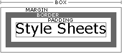
 This is one paragraph
that is wrapping around an image that's floating left.
This is one paragraph
that is wrapping around an image that's floating left. 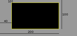